Your SEO has worked, someone on what we know as the Awareness Stage of their Buyer’s Journey has found your website.
How do you convince visitors your online base of operation is worth their time? There are so many elements that a top-notch landing page needs, and making those elements the "best" they can be often depends on what your landing page goals are.
What is the purpose of a landing page?
A landing page offers a prospective customer a resource, such as an ebook or webinar signup, in exchange for their basic contact information. The goal of these pages is to generate leads while you pull prospects further into the customer funnel.

Overall, many of the elements you want to fulfill will be shared by most Landing Page styles, however the focus of your Landing Pages will really help drive home your effectiveness.
Keep It Simple
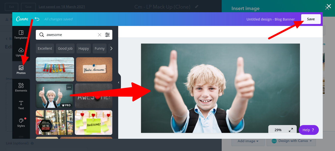
As we covered earlier, there are plenty of sources from which to get striking artwork to convey an image.
The question is, how long do you want your prospective customers to figure out what that image is?
Minimalistic artwork can quickly represent a concept, and prevent a lost viewer from becoming lost even further.
Luckily, we can read.
And we hope that our customers can, as well. Sprinkle in a concise description of what problems your product aims to solve. The closer they match to your customer’s needs, the easier those sales are going to be.
Always, always feature your CTA:
Front and center seems like a good spot, but you don’t want to come off as pushy.
However, if a prospect can’t figure out how to buy your product, you may be playing hard to get a bit too much.

Emphasize that you’re Solving a Problem.
You can have fun with this one, a technique I personally enjoy is using a “Show, don’t Tell” methodology to show a cluttered page at first, that via the power of an animation or simply scrolling down gets easier and easier to use, thanks to your product.
A Method to the Madness.
Remember, you’re not trying to scare people away. The clutter needs to be limited to a specific section of your Landing Page and a first-time viewer still needs to be able to navigate it to your CTA.
Broad Audience? Then be dynamic.
If you’re able to climb to the top of a generic, but wide Search Page, or your product is something that by nature tends to be tailored to each user, you may need to incorporate a selection form into your Landing Page.
You can ask up to three questions, and let an algorithm redirect your viewers based on their answers.
The fewer clicks, the better, and it goes without saying that having your prospective customers select their answers from a list that you created based on your preferred Customer Personas will help you easily identify their needs.

Selling Autonomy? Focus on the Freedom.
You’ll always rather have an extended relationship with your Customers, in order to boost your retention rates, but certain products aim to streamline the User Experience one has with specific facets of their life.
If you’re helping people become independent, and being their own boss, their first motivator will be the Freedom that making their own rules will give them.
Taking this step can be difficult for many, but you’re there to motivate them to Make the Jump.
Need a Striking Look? Use the Rule of Thirds.
In photography, the rule of thirds is a type of composition in which an image is divided evenly into thirds, both horizontally and vertically, and the subject of the image is placed at the intersection of those dividing lines, or along one of the lines itself.
It’s not really a rule. It’s more of a guideline or best practice, and while there are other forms of composition, the rule of thirds generally leads to compelling and well-composed shots.
Breaking the rule of thirds.
The rule of thirds may not be a hard-and-fast decree, but moving away from an artistic guardrail like this can be intimidating for a beginner. Here are a few examples of where and when experienced pros throw the guideline to the wind:
- Fill the frame: “Filling the frame is really interesting — when there are parts of an image that aren’t necessarily fully in the frame, or when there’s a subject that’s very much in the foreground of the frame,” art director and photographer Alex Tan says. “I think those are areas where you can really throw the rule of thirds away. For example, you can have a perfectly centered Landing Page, with your CTA positioned right in the middle.
- Try a different composition style: “Composing a photo in the shape of the letter Z creates a really nice flow because it’s how you naturally read a page,” photographer Sarah Aagesen explains. “The thought is that this draws you from left to right, and then down through the image and then back again.”
- Try multiple attempts: Design a Landing Page with your chosen image dead center, then one with it in the upper right, and one with it in the upper left. Even if you think you got it the first time around, you should always take two or three more attempts until you’ve got everything figured out.
You can pick which one works better later.

Ready to build your landing page?
Whether you’re using a landing page template or building one from scratch, it’s essential to keep these best practices top of mind.
Remember that your CMS Hub will let you monitor the effectiveness of your Landing Pages, so just take your time in testing them to improve their effectiveness.
On average, you’ll want to aim for a 2.35% conversion rate as that is the generic delta across industries with an online storefront, with the top 25th percentile of landing pages hitting 5.31% or higher.
If your conversion rate isn't close to the average just yet, don't worry. Nailing those percentages can be a bit challenging at first, especially if you have a lot of regular page visitors.
Regardless of what your business is selling or the conversion action you hope to instigate, it's helpful to get inspired by seeing what other great landing pages look like, so just keep an eye out in your daily browsing, and try and match the points we’ve covered today to any Landing Pages that catch your eye.
Don’t feel ready yet?
Rather than starting tomorrow, you can borrow someone else’s expertise in order to help you get started. We’re here for you.